Every December I open a search bar, type “2026 vision board aesthetic” and get the same five pictures: a beige room, a coffee cup, a palm tree, a sunrise and a planner on a desk. I scroll for an hour, save thirty of them, and still cannot say what my own board should look like.
The phrase I actually typed was “aesthetic vision board 2026”, and the result was the same.
I don’t lack ideas for what I want next year. What I lack is a way to decide what a board should look like so that it still looks like mine in March.
This guide gives you that decision in the order that works. First the word for your year, then one of five looks, then where the board will live, how big it should be, and a three-point check before you save it.
Each look comes with three colours, a number of pictures and a short list of what to leave off, so you are never staring at a blank canvas wondering what “aesthetic” is supposed to mean.
Quick answer: a 2026 vision board aesthetic is one look applied to every picture on the board, chosen after your word for the year and before you pick a single image.
- Word first: choose one word for your year, then the look that matches it.
- Five looks: soft success, cool blue, dopamine brights, dark and moody, girly pink and lavender.
- Pictures: six to nine on a phone or desk board, up to twelve on a wall poster.
- Colours: three per board, taken from your own pictures.
- Where it lives: decide the phone, laptop or wall version before you collect anything.
If you build it on a screen, a frame with fixed slots such as 50 Canva Photo Collage Frame Template keeps every picture at one scale from the start.
A vision board aesthetic is one look, three colours and one kind of light applied to six to nine pictures, with a word, a date and a number written on it.
What a 2026 vision board aesthetic is, and what it is not
People use “aesthetic” for three different things, and mixing them is why so many boards feel off.
- A look: a set of colours, textures and objects that read as one family at a glance.
- A mood: how the board should feel when your eye lands on it, calm, bold, cosy or focused.
- A goal: the thing you want in 2026. This is the part decorative boards leave out.
A vision board aesthetic is the first two serving the third.
The look is why you want the board in sight, the mood is why you glance at it, and the goal is why it is a vision board and not a wallpaper you downloaded.
It is not a feed of forty saved pictures, and it is not a gallery of someone else’s life with your name pasted on top.
There is a small number behind this. Among the seventeen phrases people type after “2026 vision board aesthetic” in Pinterest search, only four name a look, dark, girly, green and purple, and together they add up to about 2,510 searches a month.
Five name a place for the board to live, collage, poster, laptop wallpaper, wallpaper and phone wallpaper, and they add up to about 17,110. People add the word for where the board will go nearly seven times as often as the word for how it should look.
That is why this guide spends as many words on collage, wallpaper, size and poster as it does on colour.
If a picture on your board cannot finish the sentence “this is here because ___” with something you want, it is decoration, and decoration is the first thing you stop seeing.
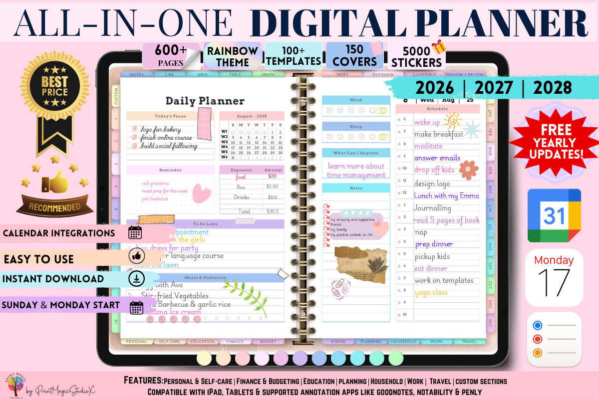
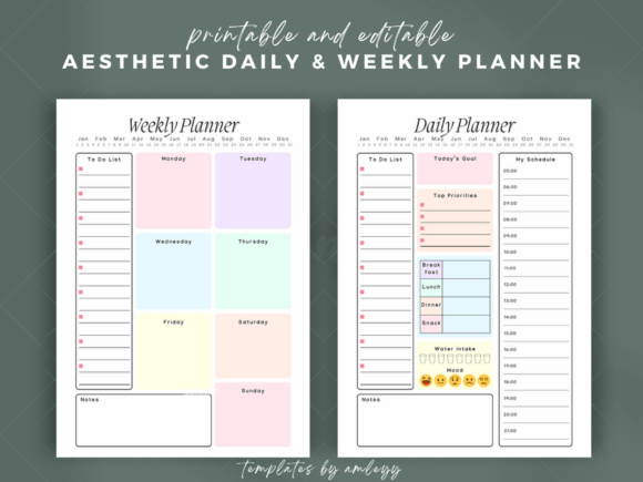
For the next steps behind each picture, a planner page such as All-in-One Digital Planner keeps the date and the number beside the image, so the look is not carrying the whole load.
How to make an aesthetic vision board in five moves
The short version
If you only want the method, this is it. The five looks later in the guide are move three.
- Choose the word. One word for 2026, picked in the next section.
- Choose the place. Phone, laptop, wall or notebook. The place decides the shape and the size, so it comes before the pictures.
- Choose the look. One of the five, with its three colours and its list of things to leave off.
- Collect six to nine pictures that obey the look. Your own camera first, then searches, as covered later.
- Add three written things. The word, a date and a number.
The order matters more than any single step. When people start from step four they end up with forty pictures and no rule, and the rest of the process becomes deleting.
How to make an aesthetic vision board without that cleanup is simply to decide the rule first, so every picture either fits it or does not get saved.
I build every board in that order now, and I have deleted far fewer pictures since I did. A fixed frame such as Editable Canva Frames for Loaded Tag makes steps two and four faster, because the slots exist before the pictures do.
The whole thing takes about an hour once the pictures are in one folder. The thinking in steps one to three takes a third of that, and it is the part that decides whether you like the board in February.
The last move is the one most boards miss. A word, a date and a number turn “I like how this looks” into “this is what I am doing by then”.
For the written part, the vision board quotes guide has short lines that stay readable at small size.
Write them in the same typeface as the rest of the board, small, in one corner. They should read as part of the look, not as a warning label.
Pick your 2026 energy word before the look
Your word is the filter that tells you which of the five looks is yours. If you pick the look first, your feed picks it for you, and the feed has no idea what next year is supposed to do for you.
Choose a word that is a verb or a state, something you could say yes or no to. “Steady”, “build”, “soft”, “ship”, “rest”, “move” and “open” all work.
“Success” and “happiness” don’t, because every picture fits them and so none of them is excluded.
A quick way to land on one is to finish three sentences on paper:
- By December 2026 I want to be more ___ than I am now.
- I want to stop ___ in the way I do it now.
- The one place in my week I want to feel different is ___.
Look at the words that repeat. If two of the three answers say calm, your word is calm, and the cool blue or soft success looks will follow naturally.
If they say louder, braver, more visible, you are in the dopamine or dark and moody territory.
A rough map from word to look
A rough map, which you can overrule:
- Steady, grounded, soft usually points to soft success.
- Focus, clear, quiet points to cool blue.
- Play, energy, visible points to dopamine brights.
- Depth, discipline, serious points to dark and moody.
- Tender, romantic, gentle points to girly pink and lavender.
I keep my word on the first page of my planner, and All-in-One Digital Planner has a clean first page for exactly that. When I lose the thread in March, I read the word and the pictures make sense again.
Write the word at the top of a blank page and keep it there while you read the rest. Every look below is a way to show it.
For a deeper walk through goals and categories before you pick the look, the 2026 vision board guide covers what to put on a board by area of life, and the vision board goals guide shows how to turn the word into a number.
Soft success: cream, sage and espresso
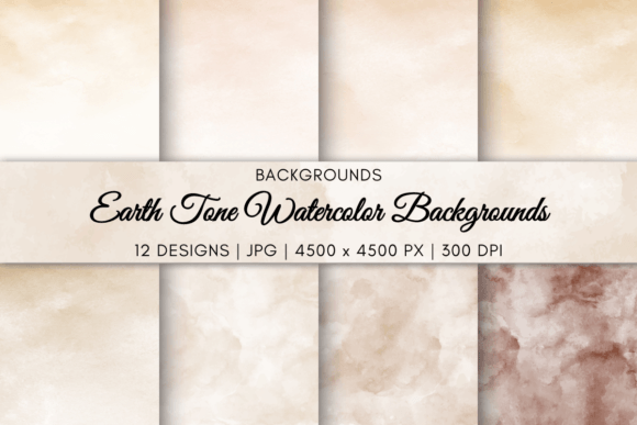
Soft success is the look of a calm, well-run life. Think linen, a wooden table, a window with morning light and a mug that has been used.
It is the most common 2026 look because it is easy to like, and also the one most likely to drift into the same five pictures. The rule that saves it is texture: every picture must show a material you can feel.
- Colours: cream, sage green and espresso brown. Nothing brighter than the sage.
- Pictures: seven.
- Light: soft, from a window, never flash.
- Put on: a clear table, a plant that is alive, a walk path, a notebook, your own hands doing something slow.
- Leave off: gold lettering, stock “boss” photos, anything glossy.
The goal sits low on the board in espresso type: your word, a date and one number. For a soft look, a number such as “four slow mornings a week” suits it better than a target with a lot of zeros.
The common mistake here is a board that is beige to the point of invisible. Keep one dark espresso object in the centre as the anchor, a cup, a leather book or a wooden chair, so the eye has somewhere to stop.
My own soft board has a linen cloth, a ceramic cup and a photo of my kitchen window, and it feels calmer than any stock photo of a beach. If you like the idea of imperfect materials, the wabi-sabi mood board guide goes further with it.
Paper planner pages in the same cream suit this look well, and Best Selling Digital Planner Bundle is a set I would pick for the bare, quiet layout.
Soft success also suits a first board. If you are not sure what you want, six pictures of how you want an ordinary Tuesday to feel is a perfectly good vision.
Cool blue: a calm desk and one clear goal
Cool blue is the look for people whose word is focus. It is clean, a little cold and works well as a laptop wallpaper because it recedes behind your icons.
It is also the easiest look to over-fill. Blue pictures from different sources drift in shade, so what you think is one palette turns out to be navy, teal, powder and turquoise fighting.
- Colours: powder blue, steel blue and white. One navy object at most.
- Pictures: six.
- Light: cool daylight, overcast or early morning.
- Put on: a tidy desk, water, an open laptop, a train window, a blank page with a pen on it.
- Leave off: neon, warm lamps, crowded rooms and any picture with a red object in frame.
Because the look is so restrained, the goal does the emotional work. Make it a single clear line in the top left, for example one project, a date and the number of hours a week you will give it.
If you are not sure the shades match, drop all six pictures into one row and squint. The one that jumps out is the one to replace.
On a laptop I put the pictures on the right and keep the left clear. A planner pack such as Mega Planner Bundle Canva keeps the same airy white, so the pages beside the wallpaper do not clash with it.
This look is the one I recommend for people who get restless looking at a busy board, because six pictures leave a lot of white and the white is part of the design.
Dopamine brights: coral, butter yellow and lavender
Dopamine brights is the opposite temperature. It is colour on purpose, a board that raises your mood even when you are tired.
The risk is chaos. Bright pictures from everywhere look like a sticker sheet, so this look needs the strictest limit of the five on colour and the loosest on subject.
- Colours: coral, butter yellow and lavender. Pick all three and no fourth.
- Pictures: nine, because bright colour reads as lighter than muted colour and can carry more.
- Light: sunny and direct is fine here, the one look where hard light works.
- Put on: a fruit stand, painted walls, a bike, a dance floor, bold shoes, hands in paint or flowers.
- Leave off: black, grey, beige and any picture that makes you tired just looking at it.
Give every colour a job so it does not feel random. Coral can mean people, yellow can mean money, lavender can mean rest. When a new picture comes in, ask which colour it belongs to.
The written goal needs the most quiet on this board. Use white or very dark type on a plain tile so the word, date and number are the one calm spot among the bright ones.
When I tried this look, I ended up with a fourth colour, a green plant, and the whole board tipped over into noise. I removed the plant and it held together again.
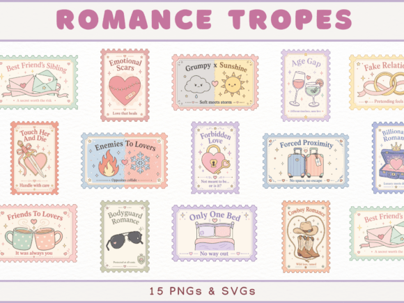
Stamp-edge tiles help here, because the border gives each loud picture its own frame. Horizontal Stamps Canva Frame Template does that in one row.
Dopamine brights is also the look that pairs best with a printable or planner in plain colours. The planner supplies the order and the board supplies the mood.
Dark and moody: black, bordeaux and one gold line
Dark and moody is the look of discipline and depth: libraries, candlelight, black coffee, a good coat. It is a vision board for people whose word is serious.
It’s the hardest look to photograph, because dark pictures turn muddy fast. The fix is contrast: each picture needs one clear light source, or it vanishes against the black.
- Colours: black, bordeaux and one gold accent used in a single line, such as the frame edge or the date.
- Pictures: eight.
- Light: one lamp or one window per picture.
- Put on: a desk with a lamp, an old book, a wool coat, a city at night, a locked drawer, a pen and a ledger.
- Leave off: pastel, anything cheerful in a forced way, and stock pictures of people in suits.
Dark boards look their best on a screen, since a screen emits the light that a printed black cannot. So build this one digitally first.
A dark planner keeps the same colours on the page where you write your steps, so the board and the plan look like one object. Dark Mode All in One Digital Planner is one built for that, with the same black ground behind your notes.
When the board is done, check it at night with the room lights off. A good dark board looks better at ten in the evening than at noon.
Girly pink and lavender without the sugar
The girly look is soft, romantic and a little playful. It’s also the one that gets mocked when it goes wrong, which is when everything is pink and nothing is specific.
The way to keep it grown-up is to let pink be a supporting colour and make the pictures themselves concrete: real rooms, real flowers, real clothes.
- Colours: dusty pink, lavender and a warm white. Use a deep plum or brown for text.
- Pictures: eight.
- Light: warm and slightly hazy, early evening.
- Put on: a dressing table, ribbon, a bunch of tulips, a hand-written card, a quiet cafe corner, ballet flats, your own handwriting.
- Leave off: glitter, cartoon hearts, neon pink and slogans in script fonts.
A good test is whether you would hang the picture on your own wall if it were printed alone. If the answer is no, it is there only because it was pink.
The goal on this board can be tender and still exact. “Soft, 1 March, three dinners with friends a month” is a goal. “Be loved” isn’t.
I would rather see eight honest pictures of a tidy dressing table than twenty of pink everything. If you build this one on a screen, 50 Canva Photo Collage Frame Template has small even slots that keep the sweetness in check.
Girly pink and lavender pairs well with the collage style in the next section, because a collage lets you keep pictures small and consistent, and small keeps the sweetness in check.
A 2026 vision board aesthetic collage: paper, Canva or both
A collage is the most searched way to build the board, by a wide margin, and it is also the one that fails most often. The usual reason is scale. Pictures pulled from different sources come in different sizes and ratios, and the board looks patched together.
Three ways to build it
There are three ways to do it, and each has a use.
- Paper collage: printed pictures, scissors and glue on a board. It feels good, it takes an evening, and you can’t undo a cut. Good for the wall and for people who want the ritual.
- Canva or app collage: pictures dropped into a grid on a screen. Fast, easy to rearrange, and it exports to phone and laptop sizes. Good for most people.
- Both: build on screen, print the final, add the written part by hand. Good if you want the wall board without the risk.
Whichever you choose, fix the grid before you place anything. Decide on a 3 by 3, a 2 by 4 or a centre picture with a ring around it, and make every slot the same ratio.
Pictures that don’t fit the slot get cropped or replaced, not stretched. This one rule gives you most of the “designed” feeling people want from an aesthetic board.
That is the thing a frame file does for you. 50 Canva Photo Collage Frame Template gives you ready layouts with slots at a fixed scale, so the grid decision is already made and you only drop pictures in.
For a plain single-row board, Horizontal Stamps Canva Frame Template does the same with a stamp-edge border.
The paid frame isn’t required. A blank grid in any design app works, and you can build your own in ten minutes. The frame saves the half hour of nudging pictures around, and the uniform size matters more than which tool you used.
Stickers and cut-outs belong in the margin only. The vision board stickers guide shows how to use them without covering the pictures.
Whatever you use, keep a margin. Leave at least a thumb’s width of space between pictures, so each one has an edge and the board doesn’t blur into a single patch of colour.
2026 vision board aesthetic pictures: what to search so they are not the same five
The repeated beige room, coffee cup and sunrise come from one habit: searching for the look. If you type “aesthetic” into any picture search, you get what everyone else typed.
Search for the object, the place or the action instead, and add the light or material from your look.
- Instead of “soft aesthetic”, try “linen sheets window morning” or “wooden table notebook”.
- Instead of “dark aesthetic”, try “desk lamp old books night” or “wool coat rain street”.
- Instead of “bright aesthetic”, try “painted wall orange door” or “market fruit stall”.
- Instead of “blue aesthetic”, try “empty desk overcast window” or “pool lane early morning”.
- Instead of “girly aesthetic”, try “tulips ribbon table” or “dressing table mirror lamp”.
Your own camera and the licence
Then use your own camera first. Six pictures of your own hands, rooms and streets in the colours you picked give you a board nobody else has, and it removes any worry about where a picture came from.
That matters for the licence. Pictures from a feed belong to whoever took them, which is fine for a private board on your phone and a problem if you print and sell it, post it for followers, or put it in a product.
For anything you plan to share, take your own pictures, use ones whose licence you have read, or use a set that was made for this use.
I keep a folder called “own” on my phone and drop a photo in whenever a light or a corner matches my colours. By December it has forty candidates, and I never open a picture search at all. A frame like Editable Canva Frames for Loaded Tag then takes whichever six I choose.
Two more search habits help. Add a verb for the year (“walking”, “writing”, “cooking”, “packing”) so you get a person doing something rather than a still life. And skip faces: a stranger’s face can’t be you, and hands, places and objects always fit.
For more on picture sources, the aesthetic vision board guide covers ten wider styles and what goes on each.
A 2026 aesthetic vision board for phone and laptop wallpaper
The search that matters here is “2026 vision board aesthetic wallpaper”, and the answer is a board built for a screen, not a screenshot of one.
This is the board you will actually see, a hundred times a day on a phone and every time you open a laptop. It is also where most people lose the effect, because a wallpaper made from a screenshot has the clock and the icons sitting on top of the best picture.
What to leave free on each screen
Plan the wallpaper around what is already on the screen.
- Phone: portrait, with the top third kept quiet for the clock and the bottom for the dock. Put the word in the middle third, small, and the pictures in the rest.
- Laptop: horizontal, with the left side kept free because icons gather there. Put the pictures on the right and the word, date and number lower centre.
- Both: build one board, then make two crops, not one stretched version.
On the phone, use fewer pictures than on a wall board. Six reads clearly through a lock screen clock. Nine starts to look like noise.
Make the type larger than you think it should be. Your word needs to be readable at arm’s length, in a bus queue, without squinting.
The other piece is the step behind each picture. A wallpaper tells you what you want, but not what to do on Monday, which is where a dated planner earns its place. 2026 Bundle Digital Planner, Goodnotes gives you year, month and week pages, so the number on your wallpaper has somewhere to go.
For the wallpaper side alone, the vision board wallpaper guide goes through sizes and setting it up on each device, and the manifestation wallpaper guide covers the written-word version.
Change the wallpaper on a date, not on a mood. Put “swap board” in your calendar for the first of every month or quarter so you replace it before you stop noticing it.
How big should a vision board be
It depends entirely on where it lives, and that is why you decided on the place before the pictures.
- Phone wallpaper: one portrait image at your phone’s screen ratio, usually close to 9:16, so check the ratio in your phone’s settings.
- Laptop wallpaper: one horizontal image at 16:9 or 16:10, matched to your screen.
- Desk or notebook board: A4 or letter, about 8 by 11 inches, so it prints on a home printer with no tiling.
- Wall board: 18 by 24 inches is a good ceiling. Past that, the pictures get far apart and you stop reading it as one thing.
- Poster print: 11 by 14 inches or 16 by 20 inches, framed.
A vision board should be small enough to take in at one glance from the spot where you will see it. If you have to step back or move your eyes around, it is too big or has too many pictures.
Resolution and picture count
Resolution matters on the wall more than anywhere else. A picture that looks sharp on a phone can print soft at poster size, so build wall boards at 300 dots per inch and check the export is not a small image blown up.
I print my desk board on plain paper first, because a mistake there costs nothing. For the pages that sit beside it, Mega Planner Bundle Canva comes in sizes that match.
Count pictures against size. For an A4 board, six to nine pictures leave each one about the size of a postcard, which is large enough to read. For an 18 by 24 wall board, nine to twelve.
So how big should a vision board be if you can’t decide? A4 on the desk and the same board as a phone wallpaper. You get a printed one to touch and a digital one to see, and it costs you one extra export.
An aesthetic poster layout for the wall

A poster is the vision board that gets framed and left alone for the year. That is its strength and its risk: a poster you can’t change has to be right the first time.
Three layouts that read from across a room
Three layouts work well because they are easy to read from across a room.
- Centre and ring: one large picture in the middle that stands for your word, with six to eight smaller pictures around it. Good for dark and moody and for soft success.
- Grid of equals: nine same-size tiles in three rows, with the written line in the middle tile. Good for cool blue and for dopamine brights.
- Two columns: pictures on the left, words and numbers on the right, as a poster with a margin. Good for a board with a lot of dates.
Leave a border of at least an inch, more if you plan to frame it with a mat. Anything inside the outer eighth of the page is at risk of being cut by the frame or a home printer.
Print one sheet at home first. Colours shift between a screen and paper, bordeaux going brown and lavender going grey, so look at the test print before you pay for a large one.
Hang it where you pass it, not where you sit. The back of a bedroom door, beside the bathroom mirror, above the desk or by the kettle all work. A poster in a room you never stand in is a poster you will never read.
I hang mine beside the kettle, since that is where I stand twice a day with nothing to do. A stamp-edge frame such as Horizontal Stamps Canva Frame Template gives a poster a finished border without a mat.
Finally, leave a strip for a date. A poster with a line that says “Review: 1 July” gets a half-year check, and a poster without one gets forgotten.
Study, gym, love and family pictures that fit your look
A look is only half of a vision board. The pictures also have to cover what you want, and some of those areas are hard to show in a soft or dark palette.
The trick is to show the setting or the object, not the achievement.
- Study: a clean desk, a stack of books with a pen, a library window, a highlighted page. Not a graduation cap, which is the same in every look.
- Gym and health: running shoes by a door, a water bottle on a bench, a towel on a rail, a path at dawn. Not a muscular stranger.
- Love: two cups on a table, a hand on a hand, a shared bike, a dinner set for two. Not a wedding.
- Family: a long table, a house with a light on, a garden chair, a car packed for a trip. Not a posed portrait.
- Money: an envelope, a savings jar, a ledger, a key. A number written beside it will do more than any picture.
Colour each area into the look by changing the object, not the subject. A study picture in soft success is a wooden desk with a cream notebook, and in dark and moody it is the same desk under a green lamp.
Pick two areas, three at most. A board with seven areas has seven goals, and the pictures end up competing.
For study, a clean Notion page works as the “next step” beside the picture, and Notion Student Planner Dashboard is a ready one. The vision board ideas guide lists more areas to choose from.
If you are building around money, the money and savings vision board guide covers how to show it without the usual banknote fan.
The aesthetic moodboard cohesion test: three checks before you save
Squint, light and sentence
When you think the board is done, run these three checks. They take two minutes and catch most of what makes a board look amateur.
- The squint test. Step back or squint until you can’t see detail. You should see three colour areas, not five. If one patch is a stray colour, find the picture and replace it.
- The light test. Do all pictures have one kind of light? A flash photo next to a candlelit one will stand out at once. Replace the odd one or darken or brighten it to match.
- The sentence test. Cover the board and try to name each picture with “this is here because ___”. Any picture without a real answer goes.
If all three pass, add a final check on the written part. The word, date and number should be readable from where you will see the board, in the same typeface as the rest.
The usual failures are a second look sneaking in, too many pictures, a goal with no date, borrowed faces and a file you never open.
Most of them are one problem with different faces: the board was made to be looked at once and not to be used. The fix is the same each time. Cut something, add a date, move it somewhere you pass.
I run these checks on every board and I still fail the light test about once in three. A planner page in the same palette, such as All-in-One Digital Planner, helps me see which picture is the odd one out, and the manifestation journal guide covers what to write beside the board.
When the test passes, save two copies, one in a folder you will find again and one as your wallpaper. Then change nothing for a month. A board needs time to work, and re-editing it weekly is a way of avoiding the goal.
For a related approach where the board is about a feeling and not a goal, the mood board ideas guide covers boards that are about a look and not about a plan.
2026 vision board aesthetic FAQ
How to make an aesthetic vision board?
Choose a word for the year, decide where the board will live, pick one of five looks and set its three colours, collect six to nine pictures that match, and write the word, a date and a number on it.
On a screen, start from a frame with fixed slots, such as Horizontal Stamps Canva Frame Template, so every picture has the same scale.
How big should a vision board be?
Match the place it lives. A phone wallpaper is one portrait image at your screen ratio, a laptop wallpaper is horizontal at 16:9 or 16:10, a desk board is A4 or letter and a wall board tops out around 18 by 24 inches.
If you are unsure, make the A4 desk board and export the same board as a phone wallpaper.
What is a 2026 vision board aesthetic?
It is one look applied to every picture on a board for 2026, with a limited palette, one kind of light and a short list of things left off.
What are some aesthetic ideas for a vision board?
This guide uses soft success, cool blue, dopamine brights, dark and moody, and girly pink and lavender. Choose by your word for the year, not by which one looks best in a search result.
How many pictures should an aesthetic vision board have?
Six for cool blue, seven for soft success, eight for dark and moody and girly, nine for dopamine brights. Up to twelve on a wall poster.
Should a vision board be digital or printed?
You can do both, with the phone version first. The screen is where you will see it a hundred times a day, and the printed one is for a wall you pass once or twice. For the screen version, 2026 Bundle Digital Planner, Goodnotes keeps the plan beside it.
Where do I find pictures that are not the same five?
Search for the object, the place or the action with a light or material attached, such as “desk lamp old books night”, and not for the word “aesthetic”. Then use your own camera for the rest.
Can I use pictures from Pinterest on a board I print?
For a private board on your phone, most people do. For anything printed to sell, posted publicly or used in a product, use your own pictures or ones whose licence you have read.
What colours should a vision board have?
Three. Take them from your own pictures, not from a trend list, and let one of them be the quiet one for the written part.
What is the difference between a mood board and a vision board?
A mood board is about how something should look and feel. A vision board keeps the look and adds a word, a date and a number, so it points at something you will do.
Key takeaways
The method fits in a short list, and it is the one I follow for my own boards.
- Choose your word for 2026 first, then the place, then the look.
- Pick one of five looks: soft success, cool blue, dopamine brights, dark and moody, or girly pink and lavender.
- Keep six to nine pictures, up to twelve on a wall poster, and three colours.
- Build the collage on a fixed grid so every picture has the same scale.
- Search for objects, places and actions, not for the word “aesthetic”.
- Make the phone or laptop version first, because that is the one you will see.
- Write one word, one date and one number, and run the squint, light and sentence tests before you save.
For the digital version, a frame with slots and a planner for the steps behind it are enough: 50 Canva Photo Collage Frame Template for the layout and 2026 Bundle Digital Planner, Goodnotes for the dates and numbers.