My first wabi sabi mood board for the flat was made of other people’s apartments. Fourteen lovely rooms, all in the same soft beige, and when I showed it to the contractor he asked one question: “Which part is the wall?”
He was right to ask. A board of finished rooms shows the mood and hides every decision. It does not say which plaster, which fabric, which wood, or how much of each.
A wabi sabi moodboard that a contractor can read is built the other way round: samples first, rooms last. This is a mood board for interior design that works on a real wall, the wabi sabi interior version: the color palette, the seven materials and the layout I now use, in the order I actually work.
Quick answer: a wabi sabi moodboard is a board of materials and one daylight, not a collage of rooms.
- Palette: ivory, linen beige, taupe, stone grey as the base, with moss green or rust used sparingly.
- Materials: seven samples, one each of plaster, linen, raw wood, stone, clay, wool or jute, and paper.
- Light: every picture taken in soft daylight, not under a spotlight.
- Layout: loose and asymmetric, samples large, objects small, empty space left on purpose.
- Label: one line under each sample saying where it goes in the flat.
The part people skip is the base under the samples. A sheet of fabric texture such as White Linen Canvas Digital Paper Texture makes a digital board read as one object before you place a single picture.
What a wabi sabi moodboard is, and what it is not
Wabi sabi is the Japanese way of finding beauty in what is imperfect, impermanent and incomplete. In a home that turns into weathered wood, rough plaster, handmade ceramics and fabric that has been washed soft.
On a board it is the opposite of a showroom. It is not a pile of rooms, not a shopping list, and not a Pinterest board with three hundred pins. It is a short, quiet page where each thing has a reason to be there.
- It is a handful of material samples, a palette, and one or two objects that show the spirit of the room.
- It is not an inventory of furniture, because furniture is the last decision, not the first.
- It is one board per room, or one for the whole flat if the materials repeat.
You can put a soft linen base such as White Linen Canvas Digital Paper Texture under all of it, and I start every board that way.
That is the wabi sabi aesthetic in one line, and the word that matters is “quiet”. If you have to hunt for the main idea, the board has too many things on it.
Why a board of other people’s apartments tells a contractor nothing
Search for a wabi sabi mood board and the results are mostly Pinterest boards, shop listings and gallery pages. Of the first nine results, only two are articles. The rest are pictures of finished rooms and products.
Pictures of finished rooms answer “what does it look like when it is done”. A contractor needs a different answer: “what is it made of, and how rough is the surface”.
- No scale: a whole room and a fabric close-up sit side by side with nothing to compare.
- No surface: plaster in a photo of a living room is a colour, not a finish.
- No place: nothing says whether that wood is a floor, a shelf or a table.
- No rights: you cannot hand someone else’s photo to a client as your own board.
A board of finished rooms shows the mood and hides every decision.
You do not fix that with more pictures. You fix it with fewer, larger, labelled samples. If you build the board on a screen, a frame with fixed slots, such as 50 Canva Photo Collage Frame Template, keeps every sample at one scale.
I use the same rule on every board now: if I cannot say where a picture goes in the flat, it comes off.
The fix, in one line, is fewer, larger, labelled samples. The next sections give you the palette and the seven samples that carry the whole board.
The wabi sabi colour palette: ivory, linen, taupe, stone, moss, rust
The wabi sabi color palette is drawn from nature and from age. Six colors cover it, and they are not equal.
- Ivory: the lightest base, warm rather than white. It is the wall and the largest area of the board.
- Linen beige: the second layer, soft and slightly grey, for fabric and large surfaces.
- Taupe: the middle weight, for wood, wool and anything that needs to sit down.
- Stone grey: the cool note that stops the warm ones going sweet.
- Moss green: one accent, used sparingly, usually a plant or a glaze.
- Oxidised rust: the second accent, a small dark warm point such as a clay vessel or a metal edge.
Think in proportion, not in a list. On the board, give the base colours most of the area, keep the middle weight for the objects, and let each accent appear once. If moss and rust both take a big area, you have drifted away from the style.
Lay the swatches as plain blocks first, before any photographs. If the blocks look calm on their own, the photographs will too.
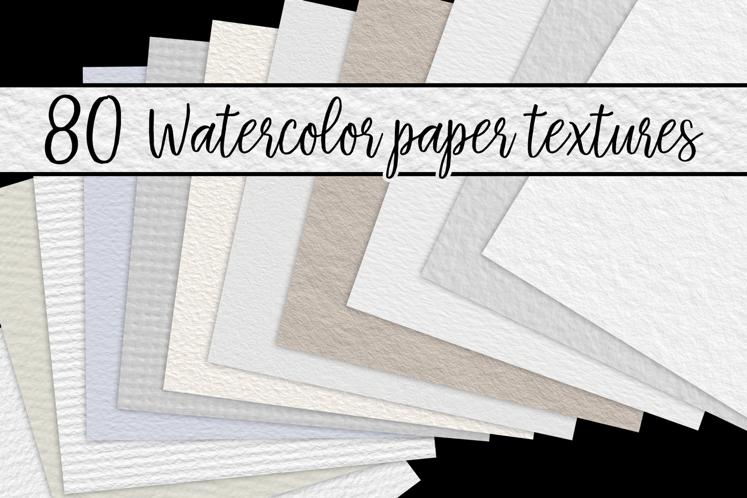
You can do this on a soft, cloudy base such as Watercolor Paper Textures, which gives the blocks the uneven edge that flat colour lacks. I do it that way every time before I look at a single photograph.
Wabi sabi materials: seven samples that go on the board
This is the part of the board a contractor reads. Take one sample of each of the seven materials below, and make each one big enough to see the grain.
- Plaster or limewash: the wall.
- Linen: curtains, bedding, upholstery.
- Raw wood: a floor, a table, a shelf, unvarnished.
- Stone: a counter, a step, a single object.
- Clay: a handmade vessel or tile with an uneven glaze.
- Wool or jute: a rug or a woven basket, something with fibre.
- Paper: a hand-pressed sheet or a lampshade, for the soft light.
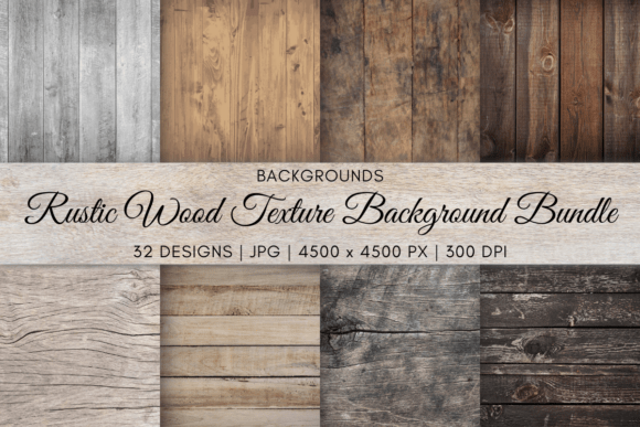
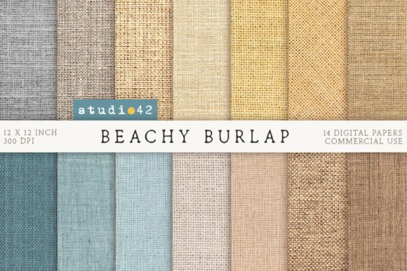
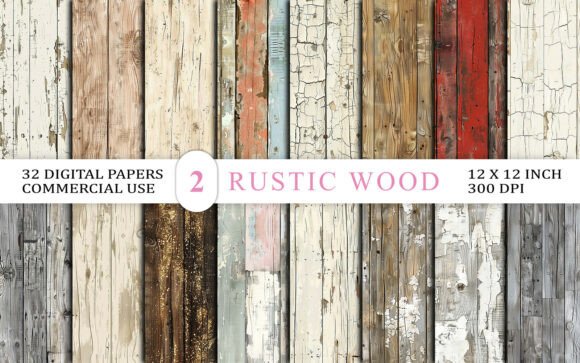
If you are building the board on a screen, you can get close-up surfaces as files instead of photographing them yourself. Packs like Beach Burlap Texture Backgrounds and Rustic Wood Texture Background Bundle give you the fabric and the wood at a size you can print.
The next four sections go through the materials in pairs, with one check for each.
Plaster and limewash: the wall sample
The wall is the biggest surface in the room, and it is where the style is won or lost. Rough plaster and limewash have a soft, cloudy variation that flat paint does not.
- Take it close: shoot or choose a sample where you can see the trowel marks, not a whole wall.
- Take it in daylight: plaster under a lamp looks flat and yellow.
- Write the finish: “limewash, matte, two coats” is something a painter can price.
Do not mix more than one wall finish on a single board. If you are choosing between two, make two boards.
On a screen board, a cloudy paper texture like Watercolor Paper Textures can stand in for the wall until you have a real sample in your hand.
Linen, wool and jute: the fabric sample
Fabric is where the board becomes tactile. Linen that has been washed soft, wool with visible fibre and jute with a rough weave all say the same thing: made by hand, used, and kept.
- Cut or photograph a real swatch at the size of a hand, not a thumbnail.
- Keep the weave visible: a flat colour tells nobody about the texture.
- Stay in the base colours: linen beige, ivory and taupe, with the accent only if the fabric is small.
Neutral fabric textures also work well as the digital backdrop for the whole board. Something like Burlap Background Digital Papers gives you a woven base to place the samples on.
Raw wood and stone: the surfaces that carry weight
Wood and stone are the heavy materials. They hold the room down and give the lighter ones something to rest against.
- Wood: raw, with the grain showing and small marks from use. Avoid glossy varnish and perfectly even stain.
- Stone: honed rather than polished, with natural variation, and preferably in one place, not everywhere.
- Together: one wood and one stone is enough. A second of either starts to look like a catalogue.
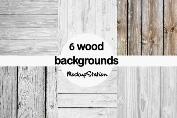
On the board, put these two at the lower edge, as the ground, and let the lighter samples sit above them. For the wood, Rustic Wood Texture Background Bundle gives you a grain you can scale to the size of a hand.
Clay and one imperfect object: how many things belong on the board
Objects are what tempt people into clutter. A handmade bowl, a branch in a jar, a cracked cup repaired with gold: each is lovely, and six together is a shelf in a shop.
Choose one object, and make it the one with a story. The point of wabi sabi is that the flaw is the feature, so pick the thing whose flaw you can name.
- One object, not five: a single clay vessel with an uneven glaze, set against plenty of empty space.
- Imperfection you can see: a chip, a crack, an irregular rim.
- Nothing symmetrical in pairs: two identical lamps is the opposite of the style.
Light: why the pictures must share one daylight
Light is the quiet reason many boards fall apart. A picture lit by a warm evening lamp next to one shot under a grey sky will never look like it belongs to the same room.
Choose one kind of light and keep to it: soft daylight, coming from the side, without a hard shadow. The phrase that keeps coming back for this style is soft filtered sunlight, and it is the right one.
- Same time of day for every photograph you take yourself.
- Same direction: shadows falling the same way on every sample.
- No flash, no spotlight: both make plaster and linen look flat.
If a picture fails on light, it is cheaper to drop it than to fix it.
On a screen board, you can keep the light consistent by building on one pale base such as White Linen Canvas Digital Paper Texture, which holds the same soft tone from corner to corner.
How to lay the board out: loose, asymmetric, samples large, objects small
Do not put the pieces in a grid. A tidy grid is the language of a catalogue, and the style is the opposite: loose, asymmetric, with room to breathe.
- Start with the base: a sheet of ivory or linen texture, filling the whole board.
- Place the largest sample first: usually the wall, off-centre.
- Add the heavy materials: wood and stone, lower and to one side.
- Add the soft ones: linen, wool, paper, overlapping the edges slightly.
- Place the one object: small, with the most empty space around it.
- Write the labels: one short line under each sample, saying where it will go.
If you use a frame for the sample slots, 50 Canva Photo Collage Frame Template is enough, and you still move the pieces off the grid by hand.
Then step back, or shrink the board to a thumbnail. If your eye lands on one thing and then rests, it is done.
Before you send the board to anyone, confirm:
- Each of the seven materials has one sample, large enough to see the surface.
- The base colours take most of the area and each accent appears once.
- Every picture shares one daylight.
- There is exactly one object, with a flaw you can name.
- Each sample has a one-line label with its place in the flat.
- There is empty space on the board, on purpose.
A wabi sabi bedroom board and a living room board
The same seven materials make both rooms, but in different proportions. The palette stays and the weights change.
- Bedroom: lead with linen and wool, soft plaster for the wall, a low wooden frame, and one paper lamp. This is the room for the softest light and the most empty space.
- Living room: lead with wood and stone, a larger plaster sample, a rug in wool or jute, and the one clay object on a low surface.
Make a separate board for each room, and let a shared material, like the same linen, tie them together. For the living room rug sample, a woven texture such as Beach Burlap Texture Backgrounds does the job of jute on a screen.
Wabi sabi, Japandi and minimalism: how to tell them apart on a board
These three are often mixed up, and on a board the difference is easy to see.
- Minimalism removes things until nothing is left. Surfaces are smooth and clean, and imperfection is treated as a mistake.
- Japandi blends Japanese calm with Scandinavian warmth. It is tidy, light, and usually well finished.
- Wabi sabi keeps the flaw. Rough plaster, uneven glazes and worn wood are the point, not a compromise.
If every sample on your board is smooth and perfect, you have made a Japandi or minimal board. Add one rough surface and one repaired object and it becomes wabi sabi.
Mistakes that turn the board back into a pile of pictures
- Too many rooms: finished interiors take the place of samples and the board stops explaining.
- Glossy finishes: polished stone, lacquer and chrome do not belong in the style.
- Everything matching: a set of identical beige things is dull, not calm.
- Two accents at full strength: moss and rust each want to be seen once, in a small area.
- No labels: without a place written next to each sample, the contractor has to guess.
- Mixed light: warm lamp photographs next to grey daylight ones.
A digital wabi sabi moodboard: textures and a frame you can print
Everything above is free to do with your own camera. Two things are harder to improvise, and they decide whether the board reads as one object.
The first is the base: a texture behind the samples that is the same material feel from edge to edge. Pinterest and the free generators give you pictures and no surface to put them on.
The second is the frame: slots at one scale, with even gutters, as a single file you can print or send to someone. And since a photograph from someone else’s page cannot go on a board you hand to a client, a licensed texture or template is the safe choice.
- Linen and canvas bases: White Linen Canvas Digital Paper Texture is the warm off-white that holds the ivory and linen beige colours.
- Wood: Rustic Wood Texture Background Bundle gives you the raw grain for the heavy sample.
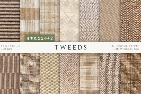
- Woven: Burlap Background Digital Papers and Tweeds Background Digital Papers cover the wool and jute sample.
- The frame: 50 Canva Photo Collage Frame Template holds your pictures at one scale if you use Canva.
Use the frame only for the sample slots, and keep the layout loose around it. A texture and a frame are enough; everything else is what you already own.
Wabi sabi moodboard FAQ
What are the 7 principles of wabi sabi?
The seven usually named are asymmetry, simplicity, austerity, naturalness, subtlety, freedom and tranquility. For a board, the useful ones are asymmetry, simplicity and naturalness, because you can see them in a sample and in a layout.
What is the wabi sabi theme?
Beauty in imperfection and impermanence: natural materials, muted colours, handmade objects and a calm, uncluttered look. Nothing is meant to be perfect or new.
What are the three rules of wabi sabi?
Nothing lasts, nothing is finished, nothing is perfect. On a board that becomes surfaces with visible wear, space left empty, and no matching sets.
Can ChatGPT create a moodboard?
It can describe one and list a palette and materials, and image tools can produce pictures. What it cannot give you is a real sample of plaster or linen at true scale, which is what a contractor needs, so use it for the first draft and build the board from real surfaces, or from licensed textures such as Rustic Wood Texture Background Bundle.
What does wabi sabi mean, and why does wabi sabi mean imperfection?
The word joins two ideas: wabi, a quiet and simple life, and sabi, beauty that comes with age. What wabi sabi means in a room is that you keep the wear and the irregularity instead of hiding them.
How is wabi sabi written in Japanese, and how do you pronounce it?
You write it with two characters and pronounce it “wah-bee sah-bee”, with the stress even. I say it the same way every time, and the idea comes from Japanese tea culture and aesthetics.
Where does wabi sabi come from, and when did it start?
It comes from Japan, from the tea ceremony and Zen thinking, and you can trace it over several centuries. It reached Western interiors much later, as a calm alternative to polished, matching rooms.
Is wabi sabi a philosophy, a real word or a real thing?
All three. It is a real Japanese word, a philosophy of accepting imperfection, and a design style you can see in a room, which is the part your board is for.
What does wabi sabi mean on TikTok, and is it slang?
It is not slang. On TikTok you will see it as a label for a calm, textured, earthy look, which is the same style described above under a shorter name.
How do I use wabi sabi in a sentence?
“The bedroom is wabi sabi: raw linen, limewashed walls and one cracked clay jug.” It works as a description of a place, a thing or an attitude.
What are the best wabi sabi paint colors, and the best wabi sabi rugs?
For paint colors, I choose warm ivory, linen beige or a soft stone grey in a matte, mineral finish. For rugs, you want wool or jute in an undyed tone, with the weave visible, and on a screen board Burlap Background Digital Papers can show it.
Which wabi sabi art and wabi sabi painting suit the board?
You want abstract, low-contrast art with visible brushwork in the base colours, and one piece only. A wabi sabi painting should look slightly unfinished, not framed and polished.
What is the best book on wabi sabi philosophy, and who are the best wabi sabi interior designers?
I would look for short essays on Japanese aesthetics rather than decor books, and for interior designers who show you their materials and finishes, not only photographs.
How many colours should a wabi sabi palette have?
You want four base colours and two accents. The base colours take most of the area and you let each accent appear once.
What colour codes are used for wabi sabi?
No code is official. You pick a warm ivory, a soft linen beige, a muted taupe and a stone grey, then sample them from your own photographs so they match your light.
How do I make a wabi sabi moodboard on Canva?
You fill the page with a linen or paper texture, drop in a frame with a few slots such as 50 Canva Photo Collage Frame Template, place the large samples off-centre, and write one line under each. Then you export one flat image.
Is a wabi sabi bedroom different from a living room?
The materials are the same. In my bedroom board the weight sits on linen, wool and soft light, and in the living room you lean on wood, stone and one larger plaster wall.
Where can I find textures for a digital board?
Licensed texture packs of linen, burlap, wood and tweed work well, such as Oxford Tweeds Background Digital Papers for the woven sample, and you can print them at home.
Key takeaways
The whole method fits in a list you can work through this evening, and it is the one I follow myself.
- You build the board from samples first and rooms last.
- Use one base of ivory or linen and keep the two accents small.
- Take one sample of each of the seven materials, large enough to see the grain.
- Keep every picture in one soft daylight.
- You choose one object, with a flaw you can name.
- You lay it out loose and asymmetric, with empty space left on purpose.
- Write one line under each sample saying where it goes.
For a digital board, a linen base and a frame are enough: White Linen Canvas Digital Paper Texture under the samples and a Canva frame to hold them at one scale.
If you are building a board for goals rather than for a room, the method is different and lives in the vision board ideas guide, the mood board ideas guide for boards that are not about a room, and the about page explains who writes these pages.