I had forty saved pictures and a board that looked like a jumble sale. Every picture was lovely on its own. Together they argued: one shot taken at noon, one at dusk, a close-up of linen next to a whole room, three different whites. The board did not say anything, it just sat there being busy.
Nothing was wrong with the pictures. What was missing was the thing nobody mentions when they hand you mood board ideas: a direction chosen before the first picture, a count, and one base underneath everything.
I rebuild these boards every few months, for a room, for a wardrobe, for a season. The six directions below are the ones that survived, each with the number of pictures and the number of colours that make it hold together.
Quick answer: choose the direction first, then take only the pictures that obey it.
- Direction: calm and warm, loud and graphic, dark and moody, minimal, nostalgic, or editorial. One per board.
- Count: six to twelve pictures, depending on the direction. Not forty.
- One light: every picture shot at roughly the same time of day.
- One scale: do not mix a whole room with a fabric close-up unless you plan the mix.
- One base: a single paper or texture behind the whole board, so ten pictures read as one.
- One place: decide now whether it is a framed sheet or a screen. Tape is why boards disappear by spring.
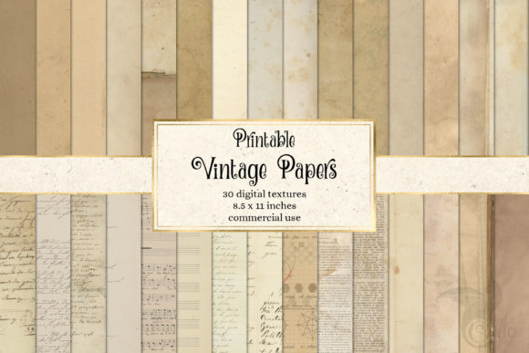
That last one does most of the work and gets skipped most often. A single sheet under everything, like Printable Vintage Paper Textures, turns a pile of clippings into a board before you move a single picture.
Mood board ideas: pick the direction before you pick the pictures
Most mood board ideas lists start with the pictures. That is backwards, and it is why boards end up looking like a browser with too many tabs open.
A direction is a sentence you can say out loud before you save anything: warm, lived-in, late afternoon, or loud, flat colour, one accent. Once that sentence exists, every picture either obeys it or gets dropped, and dropping becomes easy instead of painful.
- Say the direction in four words, including a light and a feeling.
- Write the count next to it: nine pictures, seven, six. The number is a budget, not a target.
- Name the base: paper, linen, newsprint, flat colour, or plain white.
- Then collect, and stop at the count even if you found a beautiful eleventh.
Pick the direction from what you already own, not from what you admire.
If the floor is orange oak, a cool grey board is a fantasy and you will not act on it; if your whole wardrobe is black and one red coat, loud and graphic is already true and the board just has to say so.
The nine sections after this one are six directions and two applied boards, plus the coherence rule that makes any of them work. Pick one direction and ignore the rest until that board is finished.
Pro tip: write the four-word direction on a sticky note and put it where you are assembling. Half the pictures you were about to use will stop looking necessary.
| Your four-word direction | What you rule out |
|---|---|
| Warm, lived-in, late afternoon | Flash, overhead light, anything cool grey you saved |
| Loud, flat colour, one accent | Texture and soft focus, however much you like them |
| Dark, lit from one side | Bright rooms and the white backgrounds you default to |
| Quiet, neutral, mostly empty | Pattern, and any picture past your sixth |
| Faded, aged, slightly creased | Crisp edges and anything that looks new |
| Columns, one headline, white | Overlaps and angles, however tempting |
I keep that list where I can see it, because the second column is the one that saves me time. When I know what the board rules out, I stop opening pictures I was never going to use.
Once your direction is written down, the only thing you still have to choose is the base it will sit on, and a neutral set such as Printable Vintage Paper Textures works under five of the six directions below.
What a mood board is, and what mood board means next to a vision board
A mood board holds how something should look and feel. A vision board holds what you want to happen. Same scissors, different question, and I keep them on separate sheets for that reason.
That is the whole distinction, and it decides what goes on the board. A mood board takes textures, palettes, light, materials, proportions. A vision board takes places, dates, numbers, people. Pictures that would be wasted on one are the backbone of the other, and the method for the second one lives in the vision board guide.
A mood board answers “what should this look like”; a vision board answers “what do I want to happen”. Mixing the two questions on one board is the fastest way to make both unreadable.
Why your pictures do not read together: one light, one scale, one base
When a board looks like a mess, the problem is almost never taste. It is three mismatches, and they are easy to check.
- One light. A picture taken at noon and one taken at dusk rarely sit side by side; the whites do not match and your eye reads the gap as noise. Sort your pictures by time of day and keep one group.
- One scale. A whole room, a corner, and a thread close-up are three zoom levels. Pick two: one wide, one detail, in a rough ratio of three wide to one detail.
- One base. Pictures on a white screen float. Pictures on one sheet of paper belong to each other, because the paper is the only thing all of them touch.
Run those three checks on a board you already hate. Usually two pictures are doing all the damage, and pulling them out fixes the board without adding anything.
Pro tip: squint at the board, or shrink it on your phone until the pictures are thumbnails. Whatever still jumps out is the mismatch.
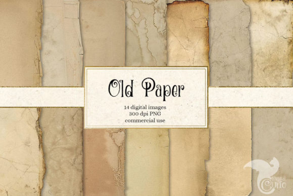
If the base is the part that is missing, that is the easiest of the three to fix: one texture sheet behind everything, such as Old Paper Textures, with torn transparent edges so the clippings sit on it rather than on a white rectangle.
Mood board ideas: calm and warm, nine pictures and three colours
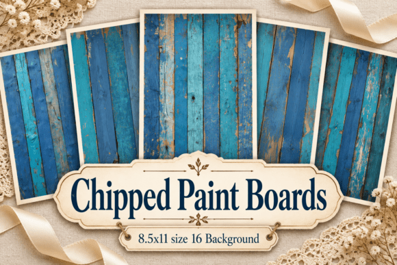
The direction most people actually want when they say they want a nice mood board. Warm light, soft materials, nothing shouting.
- Nine pictures: six wide, three details.
- Three colours: a warm off-white, a mid wood tone, one muted green or clay.
- One light: late afternoon, sun low, no flash, no overhead bulbs.
- Base: cream paper or plain linen.
- Details to include: one fabric, one surface, one plant or food.
The failure mode here is greige drift, where every picture you add becomes the same beige and your board goes flat. Keep one of the nine noticeably darker than the rest; it gives your eye somewhere to land.
Mood board ideas: loud and graphic, seven pictures and one accent
Flat colour, hard edges, type treated as an image. You will assemble this one fastest, and you will also overcook it fastest.
- Seven pictures: fewer, bigger, no little ones filling gaps.
- Two colours plus one accent: the accent appears in exactly one picture.
- One scale: all seven roughly the same size, in a grid, no overlaps.
- Base: flat saturated colour, not paper.
Here the grid is not a style choice, it is the thing holding the board together. If you scatter loud pictures at angles you get a flyer; put the same pictures in a neat grid and you get a direction.
Pro tip: if two pictures both carry the accent colour, recolour or drop one. The accent only works while it is rare.
Mood board ideas: dark and moody, eight pictures and one light source
Dark boards fail more often than any other direction, for one reason: your pictures come from different darknesses.
- Eight pictures, all with a visible light source coming from the same side.
- Two colours: one deep tone, one warm highlight.
- One scale: mostly details, one wide shot to hold the room.
- Base: deep saturated paper, so the dark pictures do not read as holes.
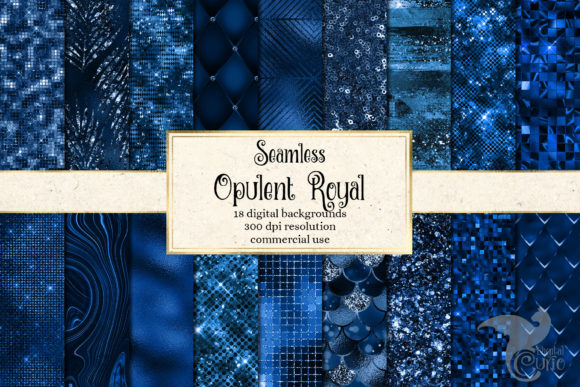
A deep base matters more here than anywhere else. Dark images on white are eight black rectangles; the same images on a rich sheet such as Opulent Royal Digital Paper become one lit scene.
Mood board ideas: minimal and quiet, six pictures and empty space
The hardest direction, because the empty space is the content and every instinct you have tells you to fill it.
- Six pictures, and genuinely six.
- Two colours: one neutral, one nearly-neutral.
- Half the board empty, in big regions, not thin gaps between pictures.
- Base: plain, no texture, no pattern.
If you cannot bear the emptiness, the direction is not minimal and that is fine; go back to calm and warm with nine. If you cram twelve pictures in, you have a calm board that went wrong, not a minimal one.
Mood board ideas: nostalgic, ten pictures on old paper
This is my own favourite, and the one direction where your base does more than your pictures. Ordinary photographs on aged paper read as memory; the same photographs on white read as a slideshow.
- Ten pictures, mixed sizes on purpose, slightly overlapping.
- One colour cast: warm, faded, slightly yellowed. Apply it to all ten.
- Torn or uneven edges rather than clean rectangles.
- Base: aged paper, newsprint, parchment.
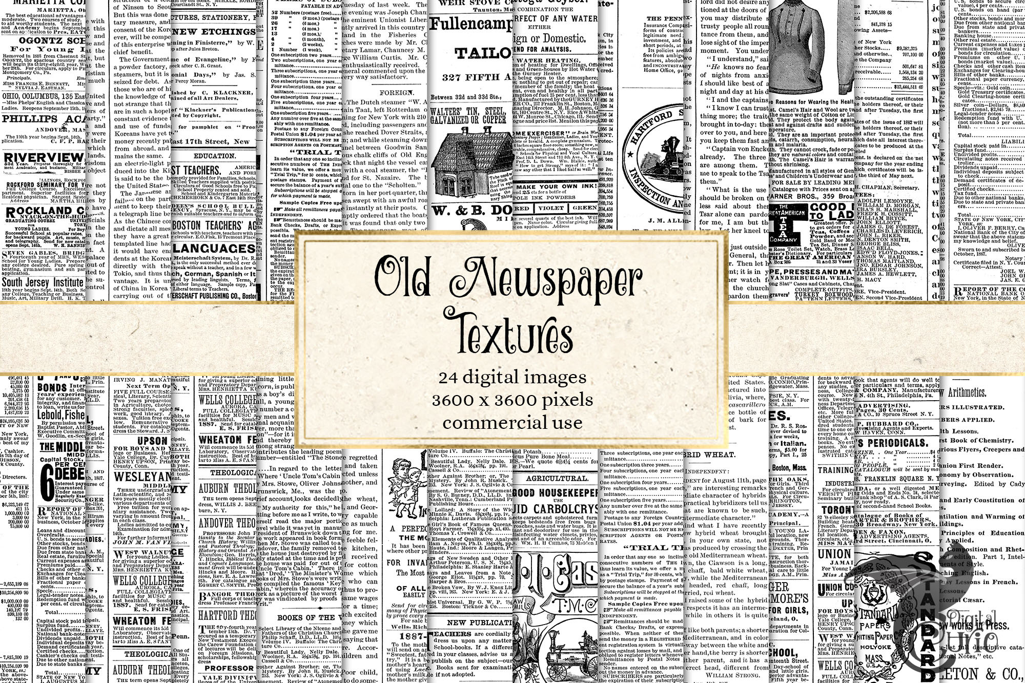
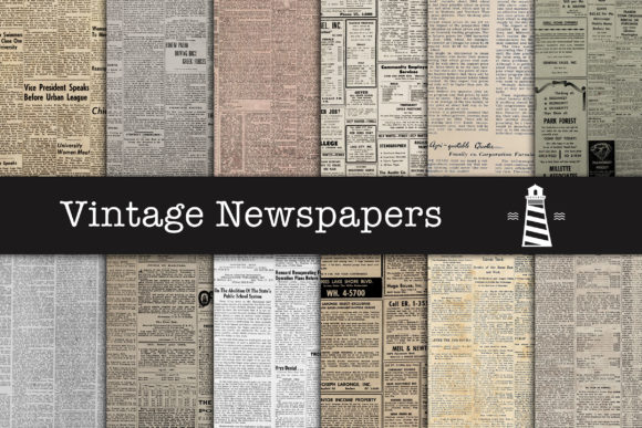
This is also the cheapest direction to assemble, because the pictures can be plain. A set of Old Newspaper Textures gives twenty-four newsprint sheets to lay under or between the pictures, and the newsprint supplies the era so the photographs do not have to.
Pro tip: print one picture, crumple it gently, flatten it and scan or photograph it. One creased picture among your ten flat ones sells the whole board for you.
Mood board ideas: editorial, twelve pictures under one headline

The magazine spread look: a lot of pictures, held in place by one line of type across the top of your board.
- Twelve pictures, laid out in columns, with narrow consistent gutters.
- One headline, three to five words, bigger than feels sensible.
- One serif, one sans, no third font.
- Base: white or near-white, so the type carries the board.
Twelve pictures only works with real alignment. Line your columns up at the top and keep every gutter identical, or you get clutter with a title stuck on it.
Moodboard ideas for interior design: paint, fabric, hardware, floor
An interior board has a job beyond looking nice: somebody else has to be able to act on what you give them. That changes what goes on it.
- Paint: a flat swatch, not a painted room. Rooms lie about colour.
- Fabric: one close-up per material, shown at the scale you will see it.
- Hardware and metal: one picture, and only one metal finish per board.
- Floor: one wide shot, because the floor is the biggest surface and sets everything.
- One room reference showing the overall feel, and only one.
Four materials, one room, one swatch: that is six pictures, and a contractor can read it in ten seconds. Thirty pretty rooms cannot be read at all, which is why interior moodboard ideas go wrong more often than any other kind.
Because somebody else reads this one, keep it on a quiet base so the materials stay the loudest thing on the page. A plain sheet from Old Paper Textures behind the swatches does that without adding a colour of its own.
An interior board is finished when someone who has never seen your house could buy from it: one paint, one floor, one metal, one fabric per material.
Moodboard ideas for a wardrobe: an outfit, not a folder of screenshots
Your wardrobe board fails the moment it becomes a collection of outfits you admire on other people. It works when each row is one outfit you could actually wear out of the house tomorrow.
- Three rows, one outfit each: top, bottom, shoe, one accessory.
- One palette across all three, so the pieces swap between rows.
- Shoes shown flat, not on a model, so you see the real shape.
- Base: neutral, because clothes carry the colour.
Most mood board ideas for wardrobe planning skip that and stay at the admiring stage. Build it as rows instead and the board tells you what you are missing, which is the only useful thing a wardrobe board does.
Build it as a wall of inspiration and it tells you nothing except that other people have nice coats.
Rows are also the one layout worth having pre-drawn, because you will rebuild this board every season. Drop your pieces into the slots of Love Photo Frames Canva Templates and every row keeps the same spacing without you measuring anything.
Mood boards aesthetic: how one aesthetic survives ten pictures
An aesthetic is not a filter you apply. It survives ten pictures when the same three things repeat in all ten, and it dies when every picture brings a new one.
- A repeated material: linen, chrome, oak, paper, glass.
- A repeated light: hard and bright, or soft and low.
- A repeated gesture: things worn in, things perfectly squared, things slightly askew.
Lay the pictures out and name those three. If you cannot name all three, you have a nice collection of pictures, not an aesthetic, and the board will keep feeling thin no matter how many pictures you add.
The repeated material is the one you can supply yourself. Running one surface through every picture frame, with something like Luxury Royal Blue Textures, gives the board a material of its own even when the pictures come from ten different places.
How many pictures on a mood board: six to twelve
Six to twelve. The exact number depends on the direction, and almost nobody will give you a number at all. Mine come out at nine most of the time, and I have never once needed more than twelve.
| Your direction | Pictures you keep | Colours |
|---|---|---|
| Minimal and quiet | 6 | 2 |
| Loud and graphic | 7 | 2 + accent |
| Dark and moody | 8 | 2 |
| Calm and warm | 9 | 3 |
| Nostalgic | 10 | 1 cast |
| Editorial | 12 | 2 + type |
| Interior or wardrobe | 6 | per material |
Above twelve, your eye stops reading the board and starts scanning it, which is the difference between a mood board and a Pinterest feed. Below six it reads as three pictures and some space.
Mood boards on paper or on a screen: which one is still there in spring
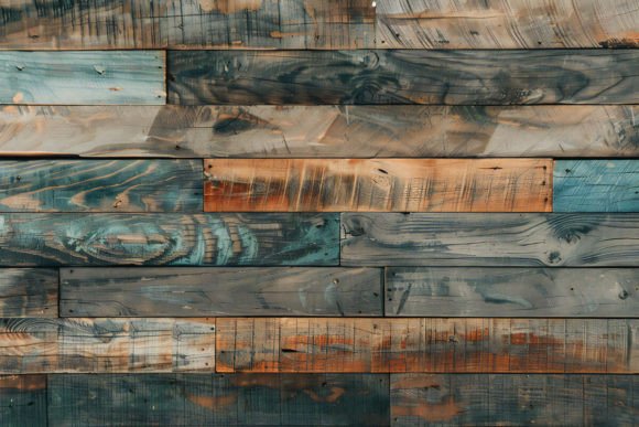
This is where boards die, and it has nothing to do with the pictures. Of the boards I have watched fail, not one failed on content; every single one failed on where it lived.
- Taped to a cupboard door. It fell for a month, got taped back up twice, then went behind the door and was never seen again.
- Printed at home and cut out with scissors. Wobbly edges, four shades of white paper, visible tape. The word for the result was monstrosity, and it came off the wall within a fortnight.
- A big board covering half a wall. It worked, in the sense that it was definitely there. It also made the room feel more cluttered, not less, and it came down.
So choose the medium as deliberately as the direction, and if you are printing, decide the paper at the same time, and a stock like Opulent Royal Digital Paper printed once as a backing sheet saves you taping clippings to a bare board:
- Paper if you will frame it or clip it. One sheet, A4 or 12×12, one paper stock, trimmed with a blade and ruler rather than scissors. One assembled sheet also settles the ink question that puts people off printing at all: you print a single page, not ten pages of pictures to cut up.
- Screen if you will see it daily: phone wallpaper, laptop desktop, tablet lock screen. Export it as one flat image so it cannot be edited into a mess.
- Both only if the paper one is framed. An unframed paper board plus a digital one means the paper one is decoration.
| Medium | Works when | How you lose it |
|---|---|---|
| Framed sheet | You trim one sheet of one paper | You never buy the frame |
| Clipped to a rail or board | You swap pictures monthly | Your clips turn into tape |
| Phone wallpaper | You export it flat and read it daily | It sits behind your app icons |
| Laptop desktop | You see your desktop often | Windows cover it all day |
| Half-wall collage | Your room is otherwise bare | Your room is already full |
I have used four of those five, and the only one I still have is the framed sheet. The clipped version lasted a season and the half-wall one came down in a fortnight.
Whichever you pick, you want the board to be one image rather than a dozen loose pieces, and that is the base again.
On paper you print your pictures onto a single sheet such as Luxury Royal Blue Textures; on a screen you export the same arrangement flat, so nothing shifts when you open it next month.
Boards do not fail because the pictures were wrong. They fail because of tape, scissors and size, so pick the medium before you print anything.
Mood board ideas you can finish tonight: the thirty-minute pass
You do not need a weekend. You need thirty minutes with a timer, because the time goes on choosing and the choosing is what you avoid.
- 0–5 minutes: write the four-word direction and the count.
- 5–15: pull pictures, stop at twice the count, no judging yet.
- 15–20: cut down to the count using one light, one scale, one base.
- 20–25: place them on the base, biggest first, into a grid or rows.
- 25–30: export as one flat image, set it as a wallpaper or print the single sheet.
The twenty-minute mark is where a frame earns its keep. A collage template with slots already sized and spaced, such as a Heart Photo Collage Canva Frame, means you drop pictures in rather than nudging ten rectangles around hoping the gaps match.
Before you call the board finished, confirm:
- The direction fits in four words and you can say it out loud.
- The picture count matches the direction, and you did not sneak in extras.
- All the pictures share one time of day.
- There are two zoom levels, not four.
- One base runs under or behind everything.
- The board is readable as a thumbnail.
- You know exactly where it will live: frame, clip, or screen.
Texture and frame files that make ten pictures read as one board
Everything above is free for you to do. Two things are not free to improvise, and they are the two that decide whether the board reads as one object.
The first is the base. Pinterest and the free generators hand you pictures and nothing to put them on, so your ten saved pins stay ten saved pins.
The second is the grid: slots at one scale, with even gutters, as a single file you can print at 12×12 and 300 dpi or hand to someone else.
There is also the plain question of rights, because a picture you found on someone else’s page cannot go on a board you hand to a client or a contractor, while a licensed texture or template can.
- Aged and paper bases: Printable Vintage Paper Textures covers thirty sheets taken from real antique paper, which is the nostalgic and calm directions handled.
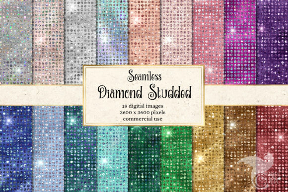
- Deep and saturated bases: Luxury Hot Pink Digital Paper and Diamond Studded Digital Paper for loud and graphic boards that need flat colour rather than texture.
- Soft gradient bases: Bokeh Mermaid Digital Paper when the pictures are busy and the base has to stay quiet.
- Frames with slots: Love Photo Frames Canva Templates are drag-and-drop in Canva, so the grid and the gutters are decided before you start.
Pro tip: buy one base and one frame, not a library. A board uses exactly one of each, and a folder of forty textures recreates the original problem one level up.
Mood board ideas FAQ
| If you are choosing | What you take |
|---|---|
| A number of pictures | Six to twelve, set by your direction |
| A base | One sheet under all of your pictures |
| A medium | Framed paper, or a screen you look at |
| A layout | A grid or rows, with your gutters even |
What is a mood board?
A single surface holding the look and feel of something: textures, colours, light and proportions, chosen so they agree with each other. It is a decision tool, not a gallery.
How do we define mood board?
By what it has to do. If it tells you and anyone else what this room, outfit or project should look like, it is a mood board. If it only shows what you like, it is a collection.
What are mood boards used for?
Narrowing choices. Mood boards exist so you stop reconsidering the paint, the fabric or the palette every week, because the decision already sits on one page.
How many images should be in a final mood board?
Six to twelve. Minimal boards take six, nostalgic ten, editorial twelve. Past twelve your eye scans instead of reading.
How do I know if my mood board is coherent enough?
Shrink it to a thumbnail. If one picture jumps out, it breaks the light or the scale. If nothing stands out at all, you are missing a dark or accent piece.
What’s the goal of your moodboard?
To end a decision. Before you start, say which decision: a wall colour, a season of outfits, the feel of a shoot. A board without a decision attached never feels finished.
How can I find mood board inspirations?
Start from materials rather than rooms. Search a fabric, a wood, a metal or a time of day, and the results arrive already agreeing with each other. If one material has to carry the whole board, a texture pack like Old Newspaper Textures gives you that material without hunting for it.
What other elements can I add?
One line of type, one flat colour swatch and one real object photographed yourself. Those three add information; extra pictures usually add noise.
How should I assemble my mood board?
Base first, biggest picture second, details last, and place everything on a grid or in rows. Assembling by feel is what produces the gaps that make a board look untidy.
Who should I share my mood board with?
Whoever has to act on it: a contractor, a decorator, whoever is buying the fabric. If nobody has to act on it, the audience is you and the board can be a screen.
Are there mood board templates?
Yes, and the useful ones are frames with fixed slots rather than finished designs. A slot grid keeps your scale and your gutters even, which is the part that is hard by hand, and a drag-and-drop set like Heart Photo Collage Canva Frame is already spaced.
Why use a moodboard instead of a static collage?
A collage is arranged to look nice; a mood board is arranged to be read. The difference shows up when you have to choose between two paints and only one of them can be answered from the page.
What should I include in a mood board for a brand campaign?
One palette, one type pairing, one photographic light, one texture and three reference images that obey all four. Five tidy decisions beat twenty moods.
Can I create a mood board if I am not a designer?
Yes, because the hard part is subtraction rather than taste. Pick the direction, set the count, apply the three coherence checks and the board will hold.
Is there a free mood board maker?
Plenty, and they all give you a canvas and a search box. What they do not give you is the base and the grid, which is why boards made in them still look like loose pictures on white.
What if I want to print my mood board?
Work at 12×12 inches and 300 dpi, keep one paper stock, and trim with a blade and ruler. Home-printed pages on mixed paper, cut out with scissors, are the single most common reason a board comes off the wall.
How do I save my mood board?
Export one flat image as well as the editable file. The flat image is the one that becomes a wallpaper or goes to the printer, and it cannot be nudged out of alignment later.
How long does it take to make a mood board?
Thirty minutes with a timer, broken into five steps. Longer than that and you are collecting rather than deciding.
What is the purpose of a mood board?
To make one decision visible so you stop remaking it. The purpose is reached the moment you can point at the page instead of explaining what you meant.
How to mood board interior design, step by step
Photograph or swatch what you are keeping first: the floor, the biggest piece of furniture, the window light. Then add one paint, one fabric per material, one metal, and one room reference that agrees with all of them.
Lay the lot on a quiet sheet such as Printable Vintage Paper Textures so your materials, not the background, are what anyone looks at.
What is a mood board in interior design, and what is a mood board in design generally?
In interior design it is a materials page: paint, fabric, hardware and floor shown together at the size you will see them. In design generally it is the same page for anything you are about to make, so you and everyone else are working from the same look.
What is a mood board in fashion, and what is a mood board in fashion design?
In fashion it is a page of silhouette, fabric and palette rather than finished outfits. In fashion design it also carries trims, stitching and a reference for the fit, because those decide whether the garment reads the way the picture promised.
What is a mood board in graphic design, and what is a mood board in architecture?
In graphic design it is type, colour and one photographic treatment, with three references that obey all three. In architecture it leans on material and light: concrete, timber, glass, and how the light falls at a given hour.
How to mood board Pinterest saves without ending up with a mess
Make a fresh board for this one direction and save into it, not into your general board. Stop at twice your picture count, then cut down to the count using one light and one scale, and put the survivors on a single base.
How to make a mood board on an iPhone
Save your pictures into one album, open a collage frame with fixed slots, drop them in and export one flat image. Set it as your lock screen so you actually see it, which is the whole point of a phone board.
How to create a mood board for a wedding
Build it around the two things that repeat all day: the palette and the flowers. Add one fabric, one stationery sample, one table setting and one light reference, and keep it to eight pictures so your suppliers can read it in one glance.
What are the best mood board apps, and is there a best mood board creator?
There is no best mood board app, and the free ones do the same job as the paid ones: a canvas, slots and an export. What changes your board is the base and the grid you bring to whichever app you already have, not the software.
Put a sheet like Bokeh Mermaid Digital Paper behind your pictures in the free app and you will see the difference before you pay for anything.
What do the best mood board examples have in common?
One light, two zoom levels, one base, and a count you can see at a glance. Every example that looks professional is obeying those four, and none of them has forty pictures.
Do mood boards work for manifestation, and do mood boards work going by what people say on reddit?
Threads about boards circle back to execution rather than belief: what to glue it to, how to arrange it, where to hang it. A board works as a decision you keep looking at, and if you want the goals version the method is on the vision board pages.
Do mood boards have text?
One line at most, three to five words, and only if the board needs a direction spelled out. Beyond that the words start doing the pictures’ job and the board gets weaker.
Can a mood board be a video?
It can, and it loses the thing that makes a board useful: you cannot see everything at once and compare. Keep a still board for deciding, and use a short clip only to show movement, like fabric or light.
Which files are worth buying for a mood board?
One base and one slot frame. A sheet such as Diamond Studded Digital Paper covers the loud directions, and a frame handles the grid; everything else you already have.
Key takeaways
The whole method fits in a list you can work through tonight. These are the eight things I check before I call a board done.
- Say the direction in four words before you save a single picture.
- Set the count from the direction: six minimal, seven graphic, eight moody, nine calm, ten nostalgic, twelve editorial.
- Keep one time of day across every picture.
- Use two zoom levels, roughly three wide shots to one detail.
- Put one base under everything, and let it do the work of belonging.
- Check the board as a thumbnail, not full size.
- Decide the medium before you print: framed paper or a screen, never tape.
- Give it thirty minutes with a timer, then export one flat image.
For the direction you are starting with tonight, one base and one slot frame are enough: a sheet from Printable Vintage Paper Textures under the pictures, and Love Photo Frames Canva Templates to hold them at one scale.
If the board you want is about goals rather than looks, the method is different and lives in the vision board ideas guide, and the about page explains who writes these pages.