You saved forty pictures you love. Warm light, soft linen, a green chair, a red coat. You put them on one board and it looks like a drawer somebody tipped out. Every picture is nice and the board says nothing.
That is the usual end of mood board inspiration. The pictures were chosen one at a time, and a board needs them chosen together.
Quick answer: a mood board holds pictures that agree. They share one light, one scale and one palette, and they sit in the same kind of frame on the same kind of base.
- Mood board: a feeling in pictures, colours and textures.
- Inspiration board: a loose pile of things you like.
- Fix: pick one anchor picture, add six, then give them a shared frame and background.
For frames that match, 50 Canva Photo Collage Frame Template gives you a set sized to hold mixed photos.
Mood board inspiration: what it is and how it differs from an inspiration board
People ask whether a mood board and an inspiration board are the same thing. They overlap, and the difference is in the job.
| Inspiration board | Mood board | |
|---|---|---|
| Job | Collect everything you like | Show one feeling |
| Pictures | As many as you want, any style | A small set that agree |
| Colour | Whatever the pictures bring | A chosen palette |
| Read in | Minutes, by browsing | About ten seconds, at a glance |
An inspiration board is where you start. A mood board is what is left after you take out what does not belong.
How people name a moodboard: by style, by colour or by character
Before you pick pictures, pick the name. A name is the first filter, and the way people name boards shows what they reach for.
Among 1027 moodboard titles in 2026, 162 (16%) name a style direction such as a “-core”, goth, academia or coquette. Another 103 (10%) name a colour or a hex code. Only 48 (5%) ask for advice, and the rest name a character, a fandom or a mood.
- By style: the easiest, because a style comes with a ready look.
- By colour: the strictest, because every picture has to carry that colour.
- By character or image: the most personal, and the hardest to hold together.
If you are stuck, take the style name. A name like “soft coquette” or “quiet academia” already rules out half your pile. For the same idea applied to goals, see vision board.
A soft base such as Coquette Bow & Striped Background Bundle fits a coquette board without extra work.
Why your pictures do not read together: light, scale and colour
When a board looks like a pile, three things are usually off. You can check them in a minute.
- Light. One picture is shot in hard noon sun and the next in a dim room. The eye reads them as two moods.
- Scale. A wide view sits beside a tight close-up of a button. Nothing tells the eye which one matters.
- Colour. Six greens, a hot pink and a brown, with no one colour repeated.
The test is simple. Step back from the screen, squint and ask what you see. If you see a pile of colours, the pictures are not agreeing yet.
I fix light first, because a different light cannot be edited away. Then scale, then colour. A shared frame helps with the second and third, and 50 Canva Photo Collage Frame Template puts every picture into the same size of window.
Three moodboard directions to copy: earthy, retro and dark romance
Moodboard inspiration ideas are easier to use when someone hands you a direction. Here are three, each with a palette, textures and what to collect.
- Earthy and quiet: oat, clay, olive, warm ivory, espresso. Linen, handmade paper, unfinished wood. Collect leafy shadows, still water and sunlit rooms, and leave a lot of empty space.
- Playful retro: tomato red, butter yellow, mint, teal, soft pink. Glossy plastic, grainy photos, patterned cloth. Collect old packaging, roller skates and graphic flowers.
- Dark romance: burgundy, charcoal, antique gold, dusty rose, parchment. Velvet, lace, aged paper. Collect candlelit rooms, arches and classical paintings.
Pick one, not a mix.
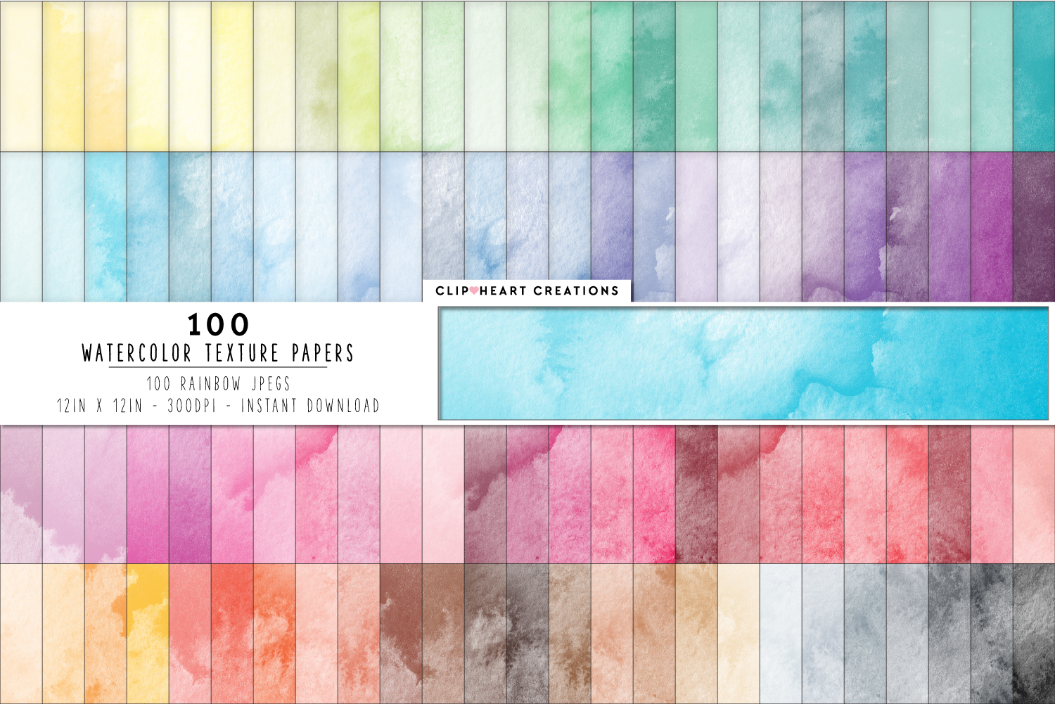
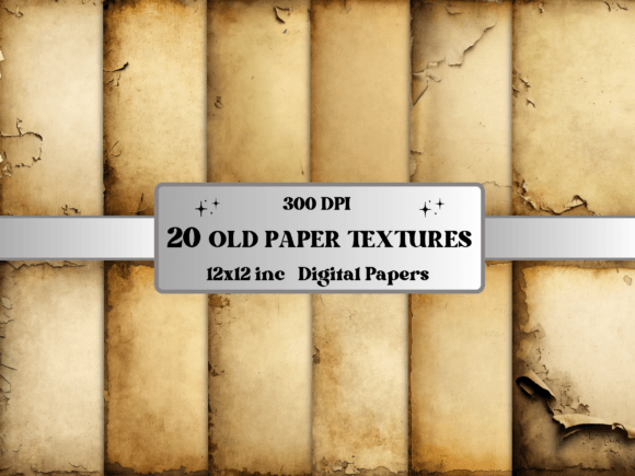
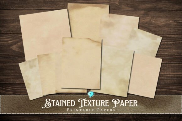
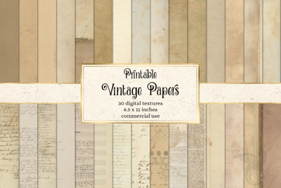
For the earthy direction I like paper texture as a base, and 100 Watercolor Texture Digital Papers has soft washes that sit behind photos without fighting them.
Fashion moodboard inspiration: wide shots and fabric close-ups
People search “what is a moodboard in fashion” and expect a gallery of outfits. In fashion a board is a roadmap for a line, a shoot or a change of style.
It works when it mixes two scales on purpose.
- Wide pictures: a person, a street, a mood of the whole look.
- Close-ups: fabric, stitching, a button, a colour block.
- Swatches: three or four colours pulled from the pictures.
Wide first, close-ups around it, colours along one edge.
Colour blocks are easy to draw in a pastel paper, for example Pastel Rainbow Background Digital Paper, which gives you a ready range of soft tones to pull swatches from.
Design moodboard inspiration for a logo, a brand or a room
“What is a moodboard in design” has a short answer: it is the look you agree on before you draw. A moodboard inspiration for logo design has fewer pictures than a room board and more space.
- Logo or brand: lots of empty room, one or two textures, one type sample, a few solid colours.
- Interior: big base elements at the bottom, such as floor and walls, then smaller swatches of cloth, paint and hardware on top.
- Shoot or event: light, place and clothes, in that order.
The rule across all three is the same. Fewer pictures, more room, one clear direction. For a longer list by theme, see mood board ideas.
Frames in a stamp shape give a brand board a cut-out look, and Horizontal Stamps Canva Frame Template is built for that.
The simple layout: one anchor, six pictures, four colours, two textures, three words
When I do not know where to start, I build a moodboard inspiration board on one layout and change only the pictures. It has five parts.
- One anchor: the biggest picture, the one that carries the feeling.
- Six supporting pictures: smaller, each saying the same thing from another side.
- Four colours: swatches pulled from the pictures.
- Two textures: paper, cloth, wood, something to touch.
- Three words: the feeling in plain language, such as calm, warm, slow.
Then remove anything that competes with the direction. If a picture would still be fine on another board, it does not belong on this one.
Look at your own pile after that: most pictures leave, and you will see the board start to read. For a calmer take on the look, see aesthetic vision board.
Textures are the part people skip, and a pack like 100 Watercolor Texture Digital Papers gives you two to pick from in a minute.
Beginner questions: what exactly to do and what to use
Newcomers do not ask for more inspiration. They ask how. One post from May 2026 says it plainly:
“I feel really inspired but also a bit intimidated… What recommendations do folks have for beginners? … But what exactly do I do? What do I use?”
A designer says the same from the other side: “I always spend so much time on moodboards and im never happy with them”. Both are about building, not finding pictures.
So here is the short answer.
- What to do: choose a name, pick an anchor, add six, pull four colours, add two textures, write three words.
- What to use: a free design app and your own saved pictures. Paper and glue work too.
You do not need design training for this, and a ready set of frames saves the part that feels hard. 50 Canva Photo Collage Frame Template is the one I would start with.
Frames and a shared base make mixed pictures read as one
Here is what free tools do not give you. Pinterest and Canva hand you pictures and an empty grid. They do not make a sunny photo and a dim one look like they belong together.
A shared frame and a shared base do most of that work. Same window size, same edge, same background, and the eye reads the board as one thing.
- 50 Canva Photo Collage Frame Template: fifty editable frames for Canva, so every picture lands in a window of the same shape.
- 100 Watercolor Texture Digital Papers: 100 papers at 12 by 12 inches and 300 dpi, a soft textured base for earthy boards.
- Pastel Rainbow Background Digital Paper: pastel patterns in a range of soft colours, for light and playful boards.
- Coquette Bow & Striped Background Bundle: soft stripes and bows for a coquette board.
None of these is a finished board. You add your own pictures on top.
How to build the board in Canva, step by step
The steps are the same for any direction. I do them in this order every time.
- Name it: a style, a colour or a character.
- Set the base: upload a paper and put it on the page.
- Drop in the frames from your set, one big and six small.
- Add the pictures, starting with the anchor. Check light first.
- Add four swatches and two textures along one edge.
- Write three words in one font.
- Squint. If it reads as one feeling, download it. If not, swap one picture, not all of them.
If you want the board on a phone screen, check vision board wallpaper for how much a small screen can hold. A base such as Pastel Rainbow Background Digital Paper goes into step two.
Vision Board vs Mood Board: Which One to Make
A mood board and a vision board look alike, but they answer different questions. A mood board captures a feeling: colour, light, texture and style, so you can keep a project or a room consistent. A vision board captures goals: the things you want in your life, shown in pictures.
If you want a look for a brand, a shoot or a bedroom, make a mood board and keep the pictures tied by one palette. If you want to stay focused on what you are working toward, make a vision board and choose pictures that show the result, not the style. Many people start with a mood board to find their look, then reuse the same palette for a vision board so both feel like one set.
Mood board inspiration FAQ
What is mood board inspiration?
It is the set of pictures, colours and textures you gather to show one feeling before you start a project. The word inspiration covers the pile, and the board is what you keep from it.
Is a mood board and an inspiration board the same?
Not quite. An inspiration board collects everything you like. A mood board keeps only the pieces that agree and shows a single feeling.
What is a moodboard in fashion?
A roadmap for a look or a line: a few wide pictures, close-ups of fabric and four or so colours, all in one direction.
What is a moodboard in design?
A short visual agreement made before the design starts: pictures, textures, colours and a few words that say what the result should feel like. Try a set of matching papers such as 100 Watercolor Texture Digital Papers as the base.
How many pictures should a mood board have?
Seven is a good start: one anchor and six around it. More pictures usually mean a pile.
Where do I find mood board inspiration images?
Moodboard inspiration Pinterest boards are a fine place to start: save from places you already use, then pick only the ones that share a light and a palette. You can also take your own photos, which always match your taste.
Key takeaways
- A mood board shows one feeling, and an inspiration board is the pile it comes from.
- Pictures read together when they share light, scale and colour.
- Start with one anchor and six pictures, four colours, two textures and three words.
- A shared frame and a shared base do the work a free grid leaves out.
- Squint at the board. If it reads as one feeling, it is done.
For frames that match, start with 50 Canva Photo Collage Frame Template and build the rest in Canva.